

Improved charts throughout SELECT
Tuesday, September 16, 2025
 Mike Bertrand-PickfieldProduct Engineer @ SELECT
We’ve updated our chart component making it more flexible including some commonly requested changes.
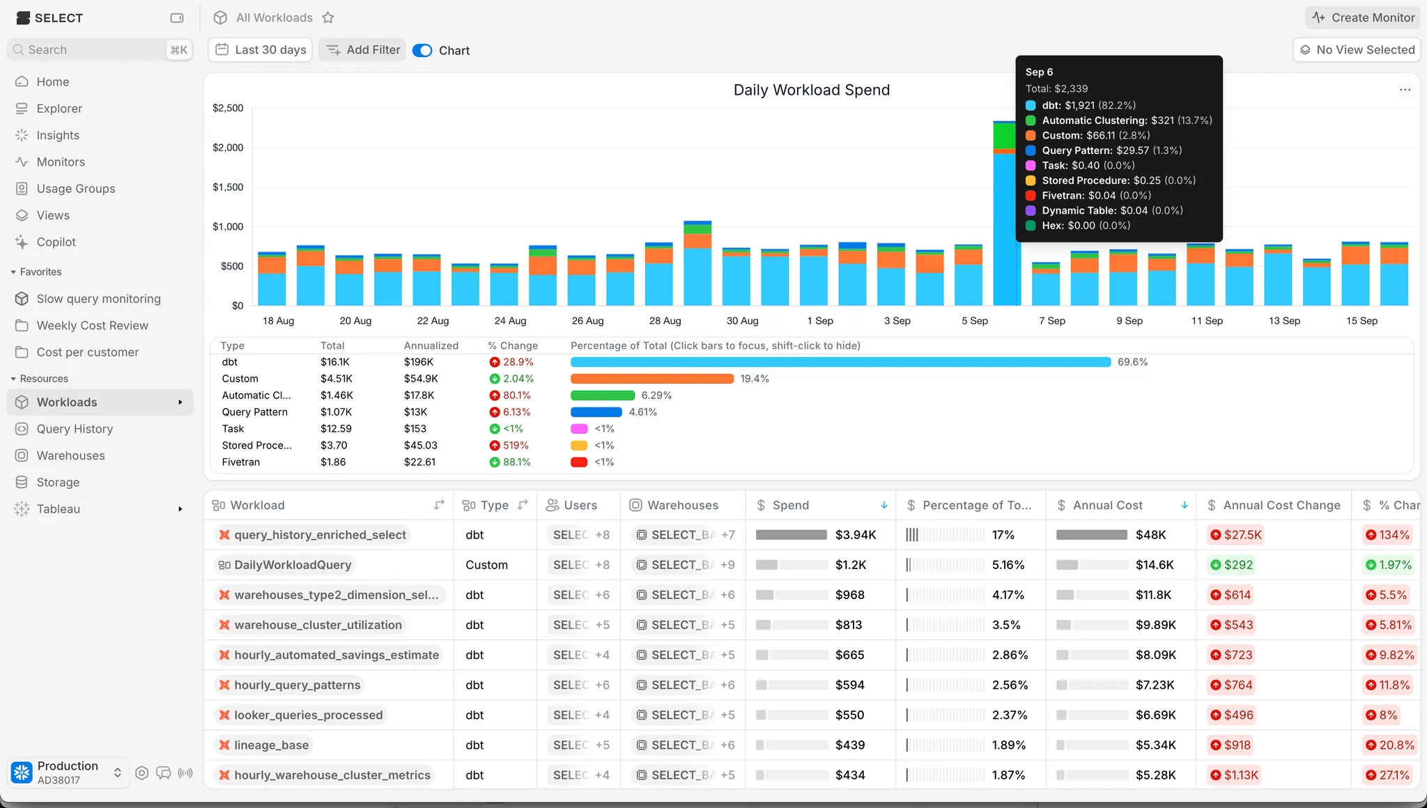
Our stacked bar chart now places the largest contributor on the bottom, making it easier to see how other metrics are contributing to the total.
Styling has been made consistent with our new look ✨ that we rolled out earlier this year, including an improved tooltip!
Next up we’ve got 3 improvements in one screen shot, a new cumulative chart type, an optional more compact legend, and an optional comparison with the previous period! All of these new options can be accessed through the chart options picker at the top right.
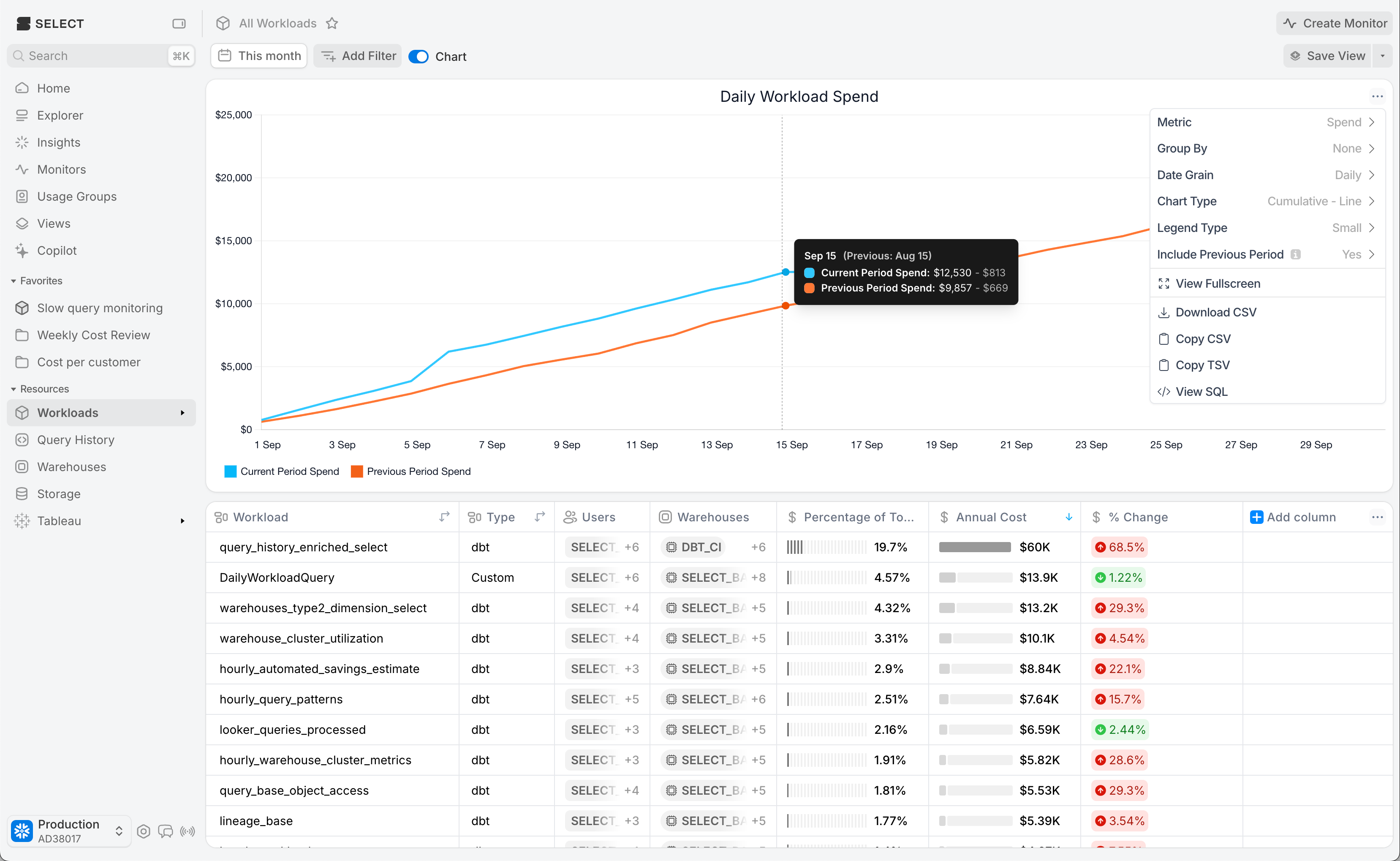
Is the chart too small to see all the data that matters? The new fullscreen mode can help you dig into the details.
Finally, links in the table chart are now more consistent, if the pages table supports linking to a metric, the table style legend will also support linking to that metrics page!
We’ll be building on this chart more in the coming weeks when we release forecasting mode charts, using machine learning models to project how your spend will trend over time.
Other Things We shipped:
- 🐛 Fixed issues with object tags not propagating to snowpipes
- 🪄 Improved page load times when using object tags in filters or usage groups
- 🪄 Time-series Databases data source in monitors
Up next.Previous Changelog Entries.