Custom Dashboards
Custom dashboards let you build your own views across any combination of resources, metrics, and time ranges. Use them to monitor spend, track key signals for your team, and share progress with stakeholders.
Where to find dashboards
Open Dashboards from the left navigation. This lists every dashboard you can see, grouped by scope:
- Personal — dashboards only you can see.
- Team — dashboards shared with a team you belong to.
- Public — dashboards shared across your entire organization.
Starred dashboards appear at the top for quick access. Use the search field to filter by name.
Creating a dashboard
Click New dashboard in the top right. You'll see three ways to start:
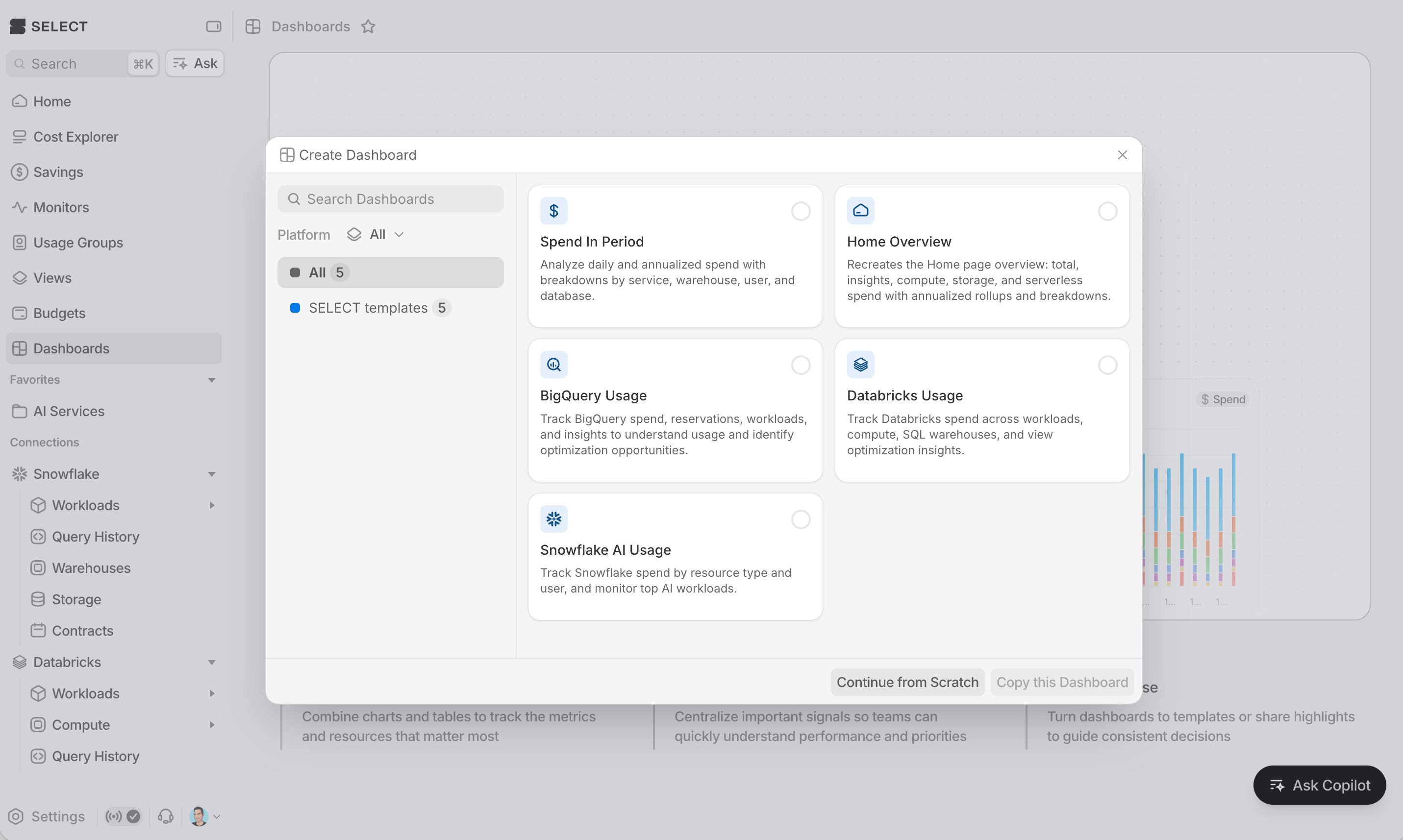
Starting from a template
Ready-made templates cover common use cases. Pick one and a new dashboard will be created with the template's blocks and layout, ready to customize.
Dashboards your organization has already created also appear as templates, so teams can build on each other's work.
Starting blank
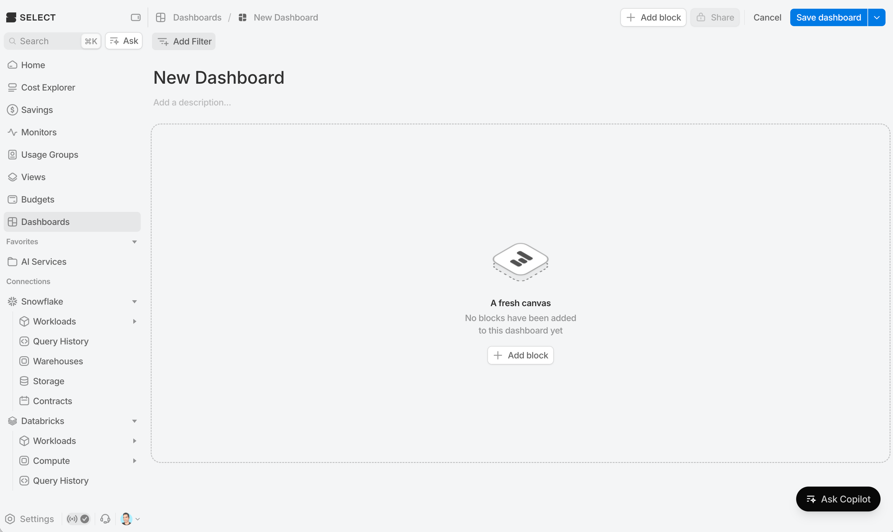
Choose Continue from Scratch to start with an empty grid.
Duplicating an existing dashboard
Any dashboard you can see can be used as a starting point. From the dashboards list, you can duplicate any dashboard via the options menu at the right.
New dashboards start private to you. When you're ready to hand one off, change the scope from the Share button
Block types
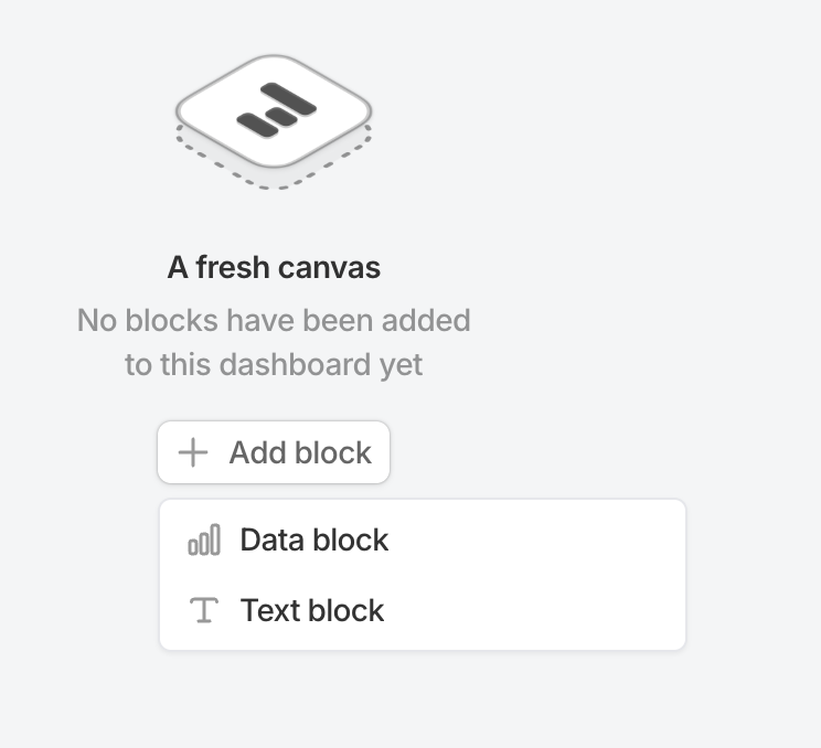
Every dashboard is built from blocks. There are two types: data blocks (backed by your Snowflake, BigQuery, or Databricks data) and text blocks (markdown for headings, notes, and context).
Click Add block in the dashboard editor to choose between them.
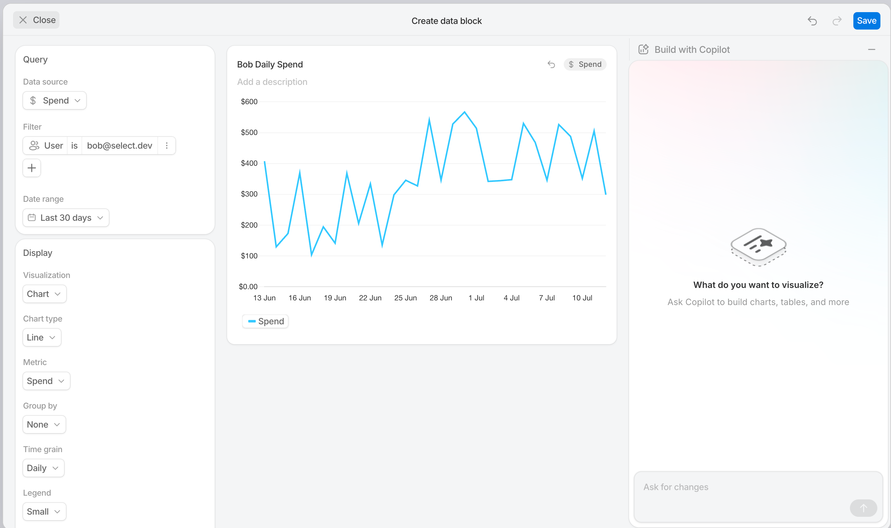
Chart
Line, bar, stacked bar, percent bar, cumulative line, and forecast charts. Group by any dimension — warehouse, workload, user, cost type, and more. Optionally overlay logged savings actions to correlate cost changes with team activity.
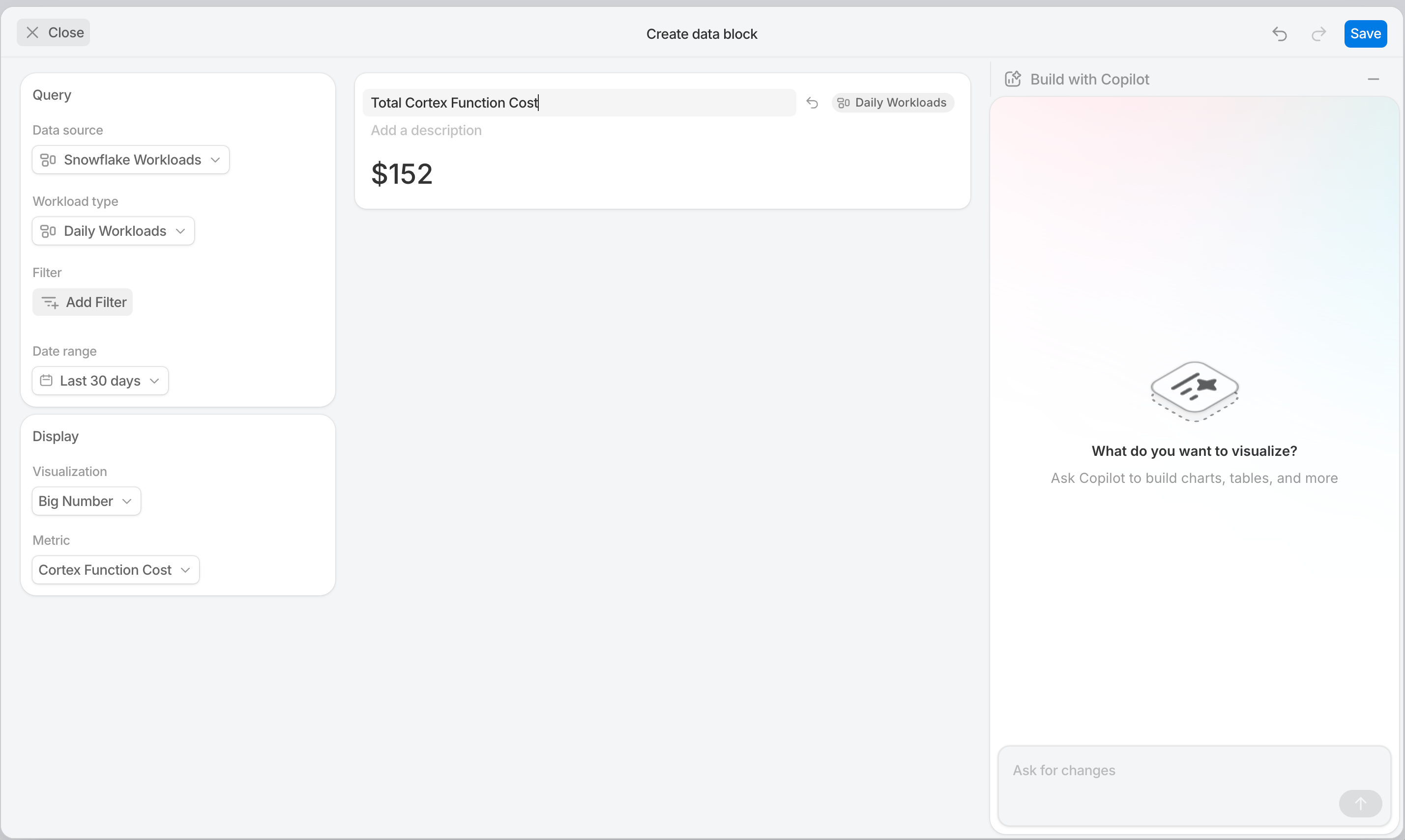
Big Number
A single KPI, prominently displayed. Optionally show a previous-period comparison as an absolute value, a percent delta, or both.
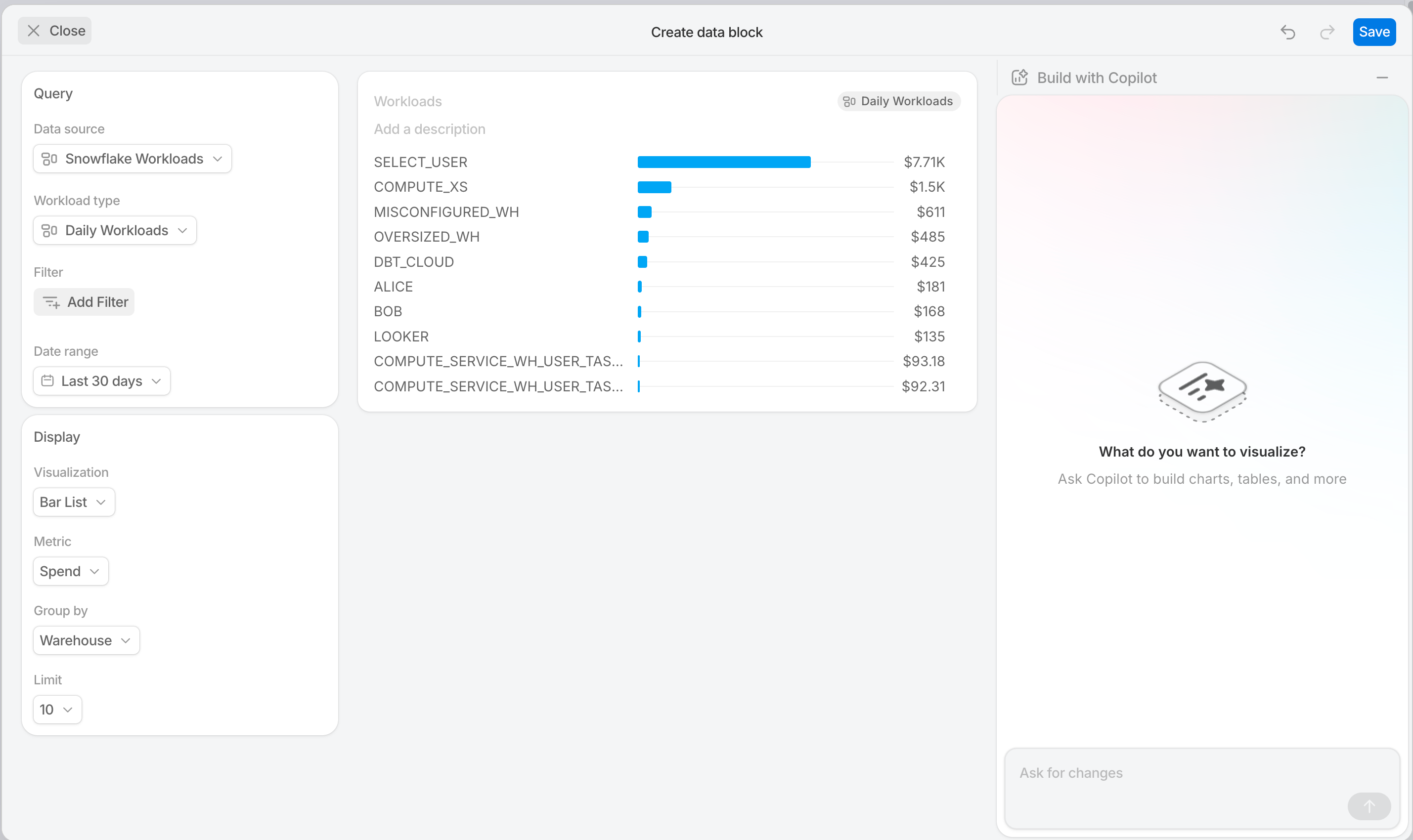
Bar List
A top-N horizontal ranking. Pick a metric and a group-by dimension; set the row limit. Ideal for "top 10 warehouses by spend" style views.
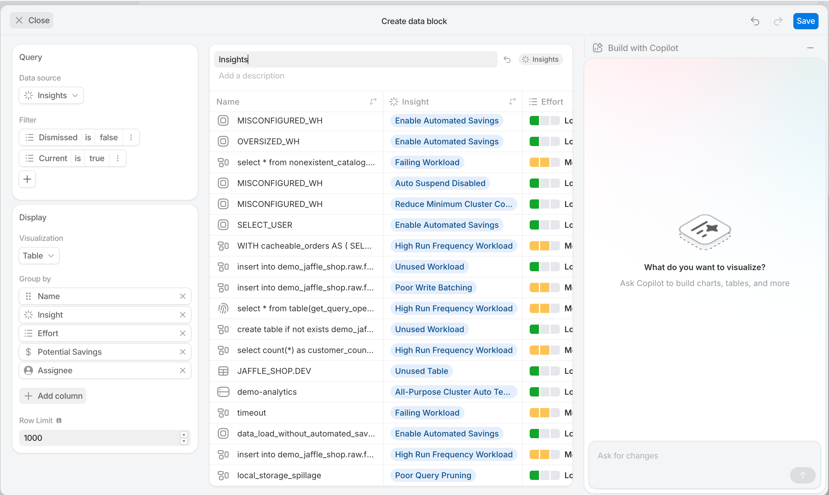
Table
Rows of data with sortable, rearrangeable columns. Configure which columns appear, the default sort, and the row limit (up to 1,000).
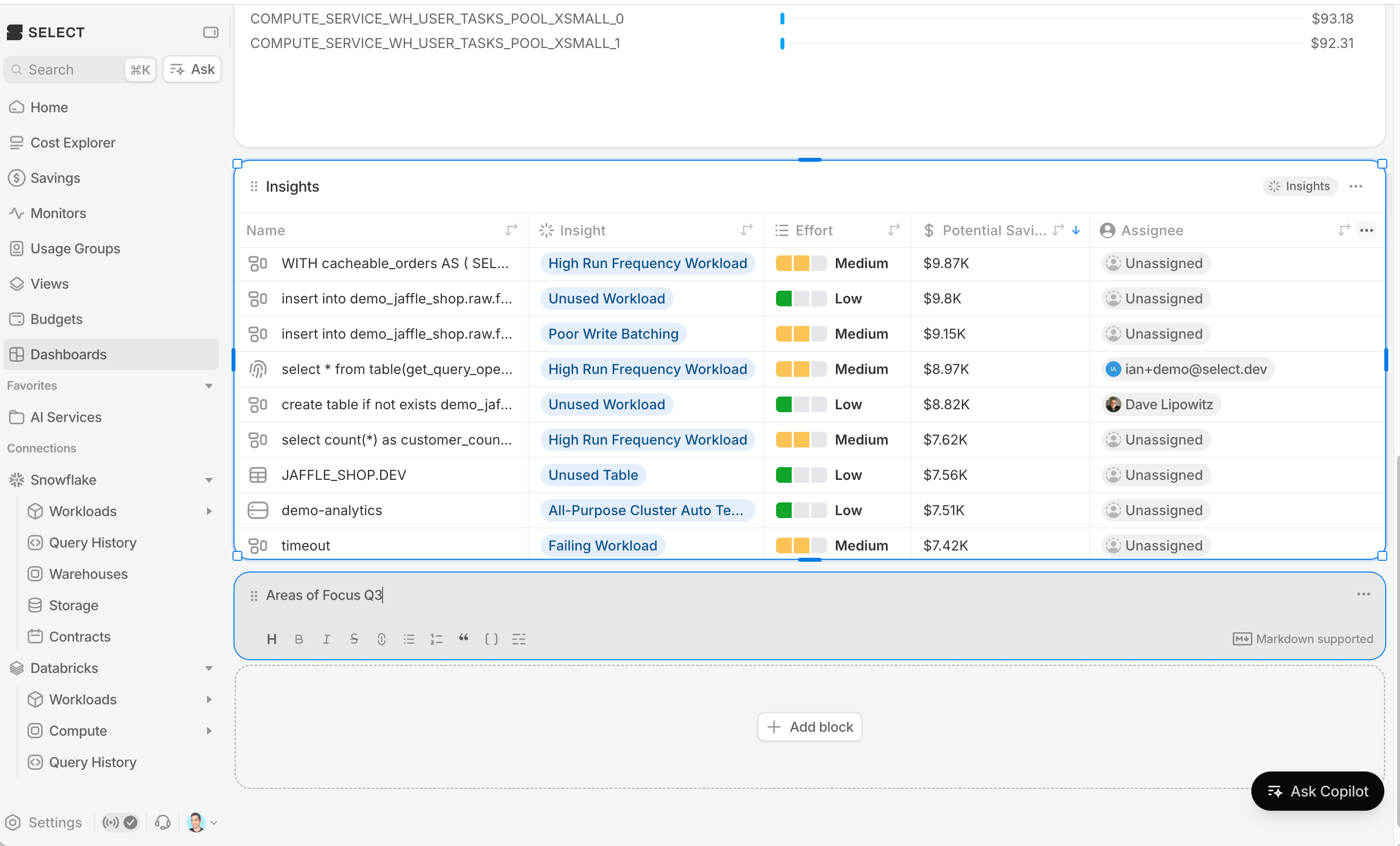
Text
Rich markdown for headings, section dividers, narrative, and links. Use text blocks to explain what a dashboard is for, call out important context, or link to related resources.
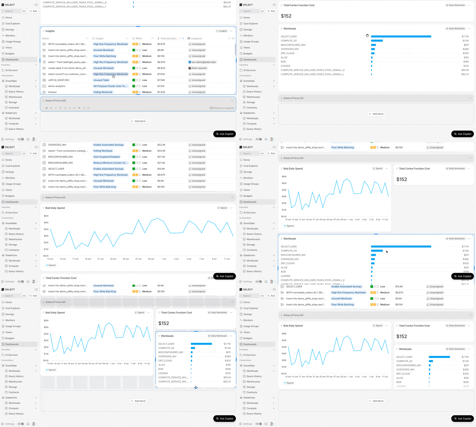
Arranging the dashboard
Use resize handles and drag and drop to layout out the dashboard as you like
Configuring blocks using Build with Copilot
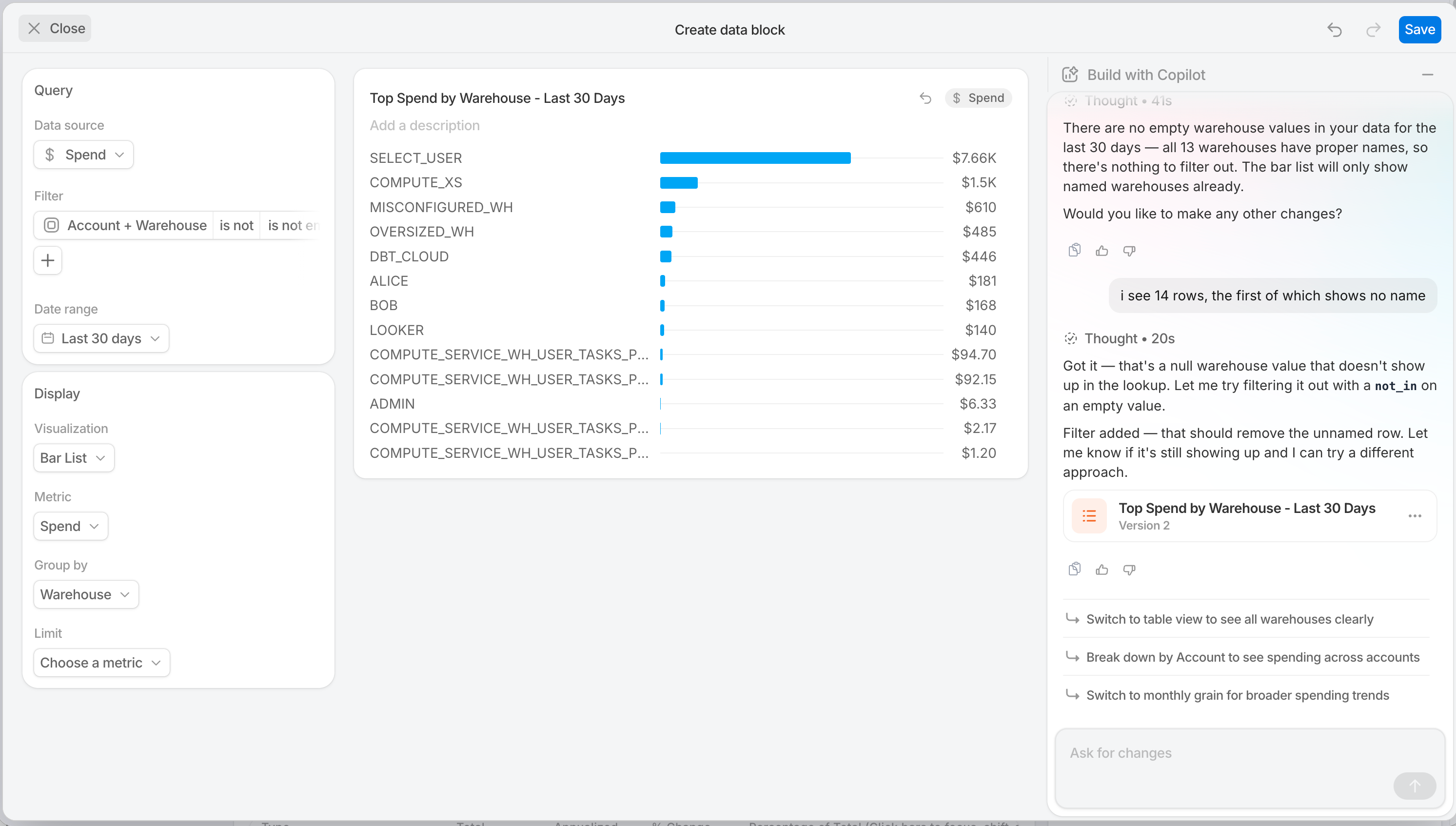
Every data block can be configured by hand — pick a data source, a visualization type, group-by, filters — or you can describe what you want in plain language to Copilot and and let it configure the block for you.
Open the block editor and expand the Copilot sidebar. Ask questions like:
- "Show me daily Snowflake spend by warehouse for the last 30 days."
- "What are my most expensive queries this month?"
- "Compare this quarter's compute cost to last quarter, by workload."
Copilot picks the data source, visualization, group by, and filters, then generates a live preview in the block editor. Every field it sets remains editable — treat its output as a starting point, refine as needed, and iterate by asking follow-up questions in the same conversation.
Combined filters
Dashboards support filters at two levels: dashboard-level filters that apply to every applicable block, and block-level filters that narrow a single block's data.
Dashboard-level filters
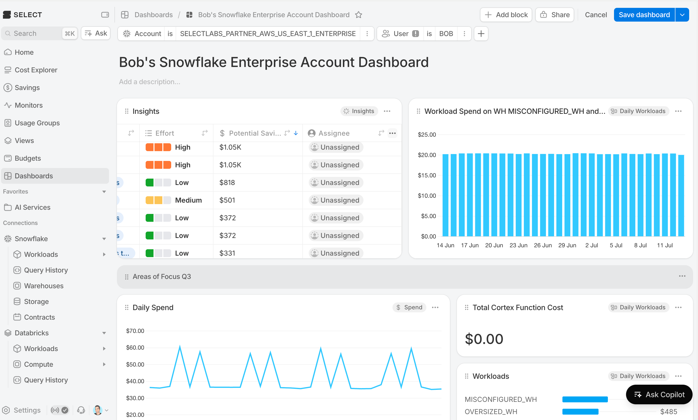
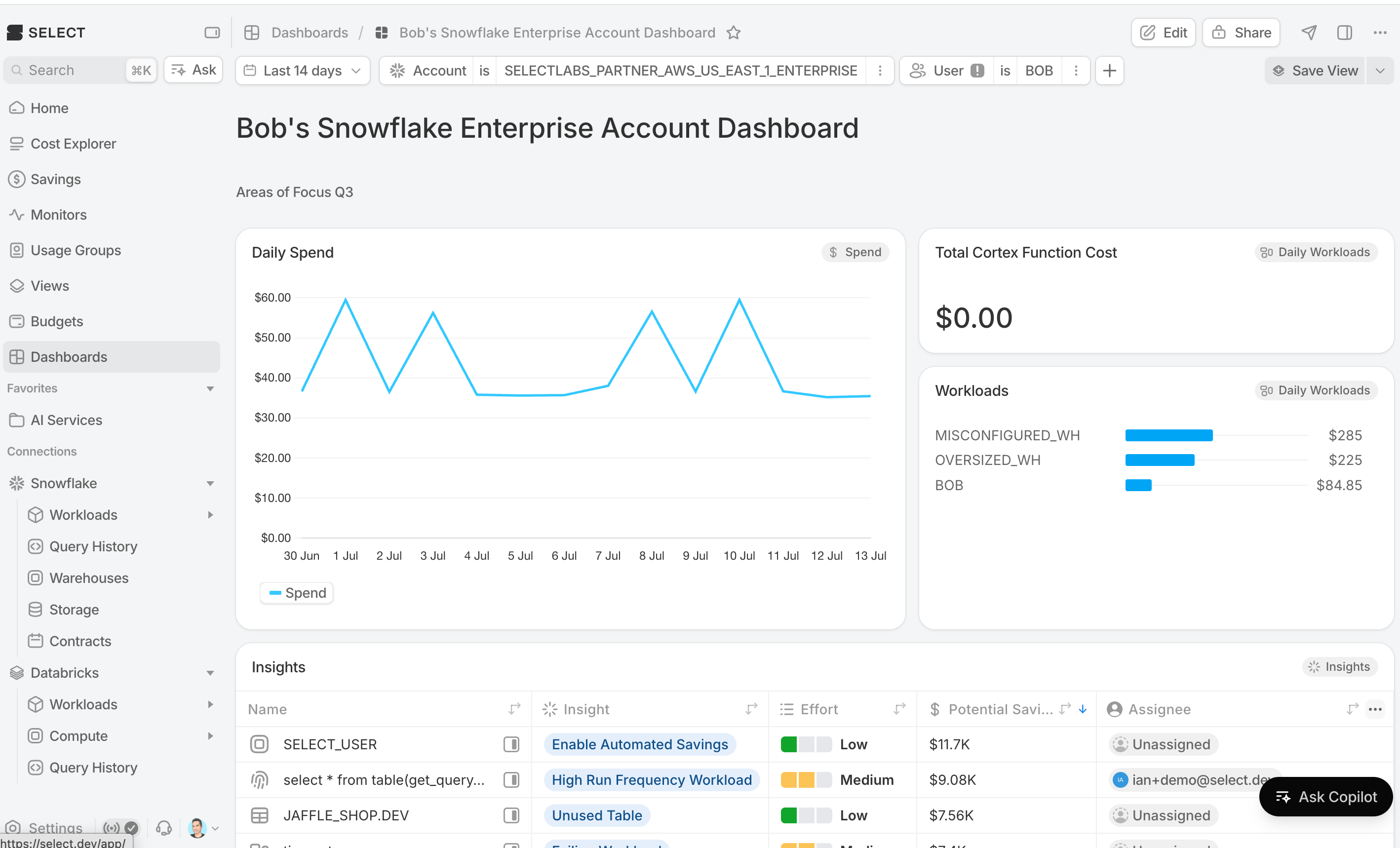
The filter bar at the top of the dashboard applies to every block. Use it to scope the entire view to a date range, a warehouse, a workload, or any other dimension. Dashboard filters combine with each block's own scope — the block will see the intersection.
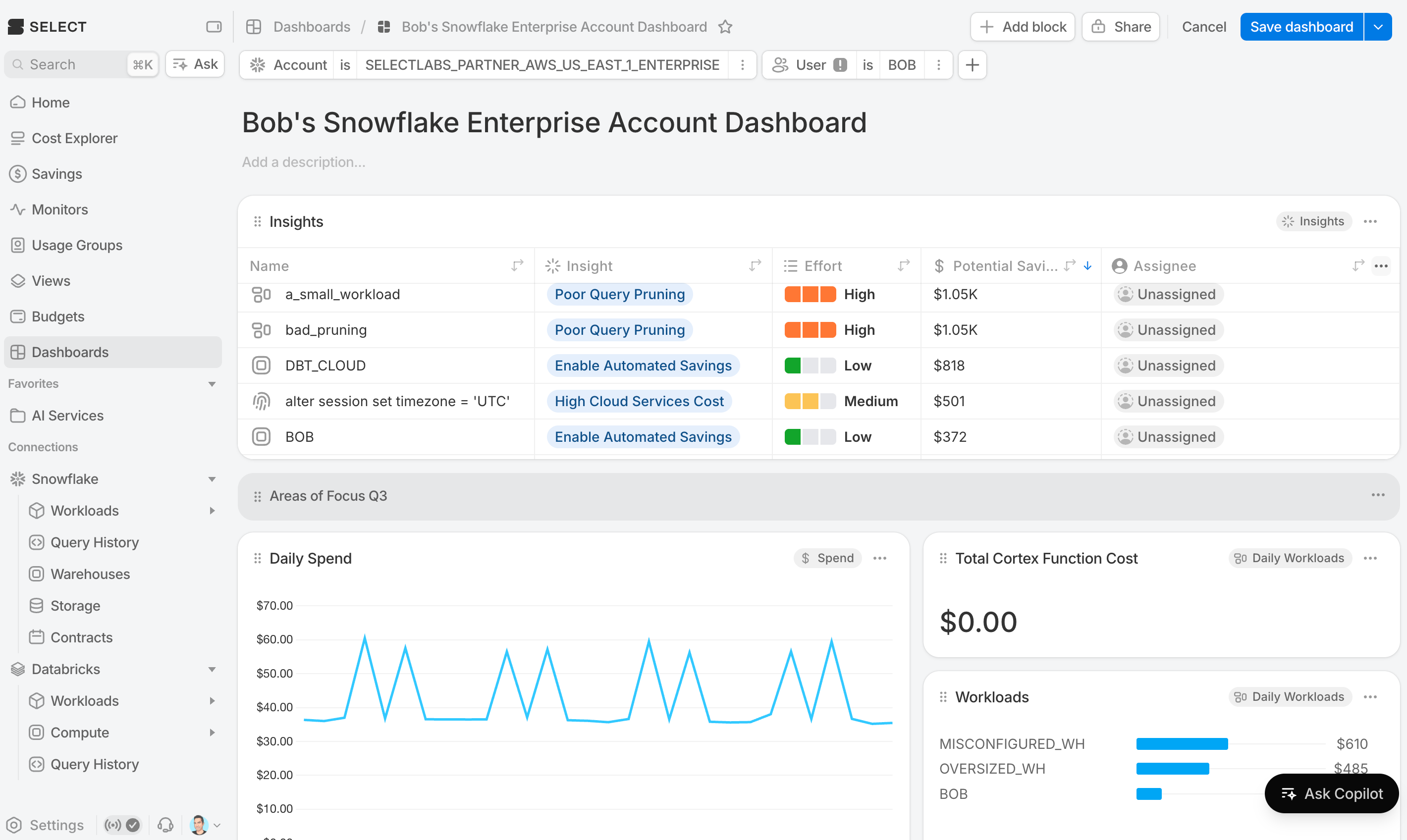
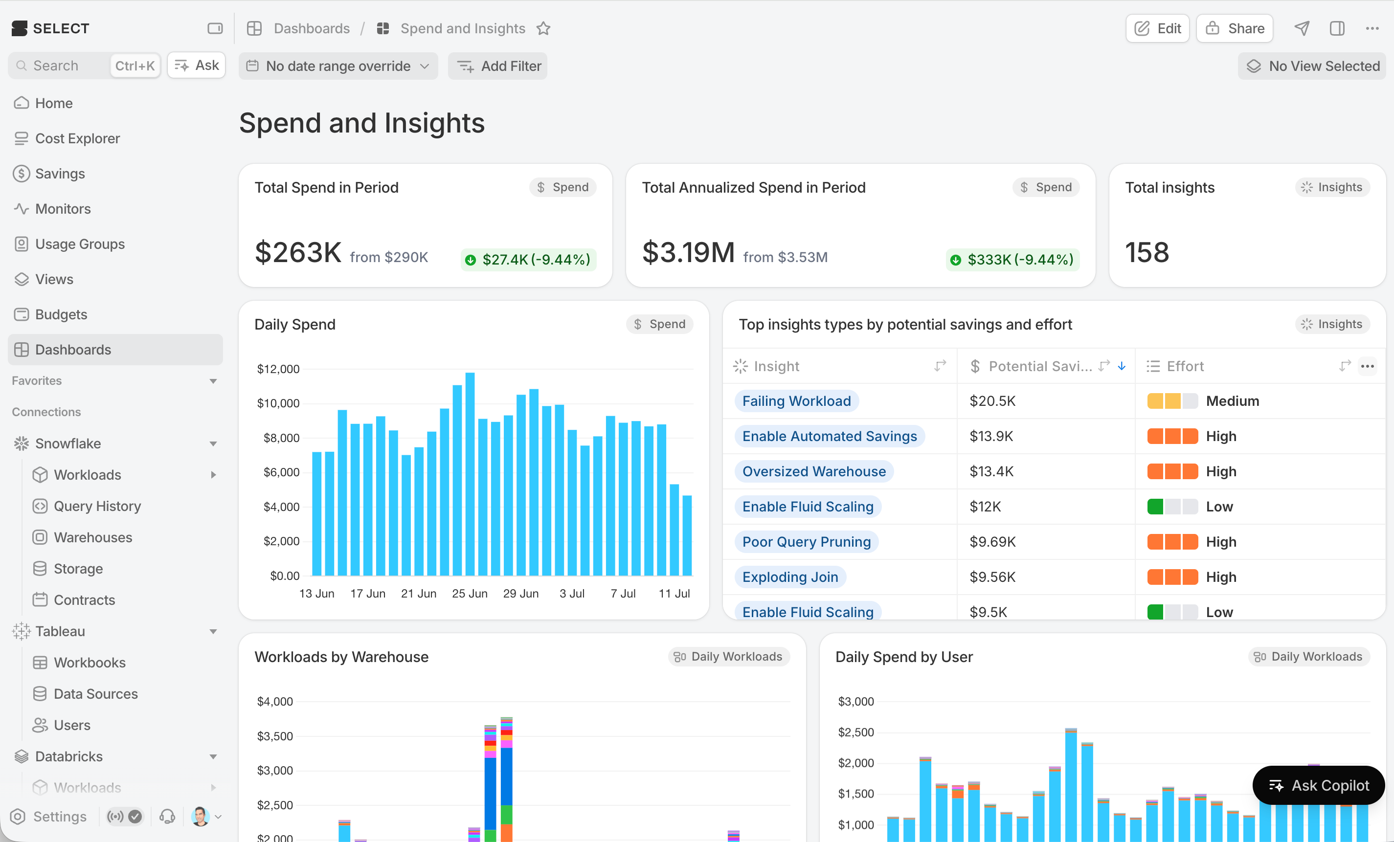
Note here that filter User is Bob does not apply to the Insights table. The warning icon in the filter pill indicates that the filter does not apply to all data sources.
Block-level filters
Inside the block editor, each block has its own Filters panel. Use these to pin a single block to a specific slice — for example, keep a block scoped to "prod warehouses only" even as the surrounding dashboard filter changes.
Date ranges and time grain
Filter by a relative window (Last 7 days, Last 30 days, Month to date, Year to date) or an absolute start/end date. Set the time grain to day, week, or month to control how data is bucketed on charts and tables.
Sharing and visibility
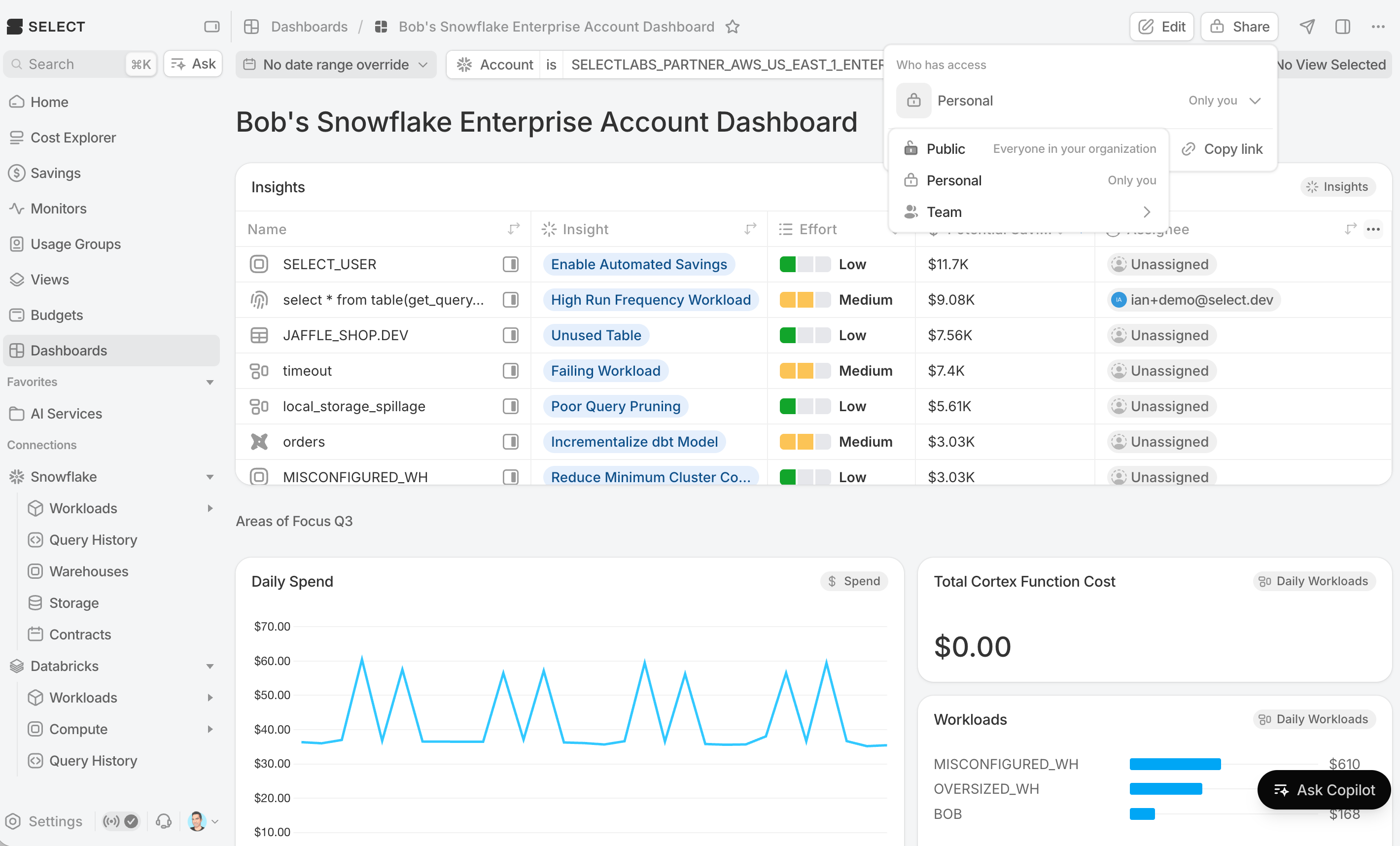
Every dashboard has one of three scopes:
- Personal — only you can see it.
- Team — everyone in a team you choose can see it; other Select users cannot.
- Public — everyone in your organization can see it.
Click Share in the top right to change the scope.
Who can edit a shared dashboard depends on the viewer's role in Select — for example, Org Viewers can see Public dashboards but can't edit them, while Org Admins can edit anything shared to the organization. Team dashboards require team membership.
⚠️ Changing a dashboard's visibility away from Public will unset it as your organization's home dashboard if it was configured as such.
Setting a dashboard as your homepage
You can make any dashboard the first thing you see when you open Select.
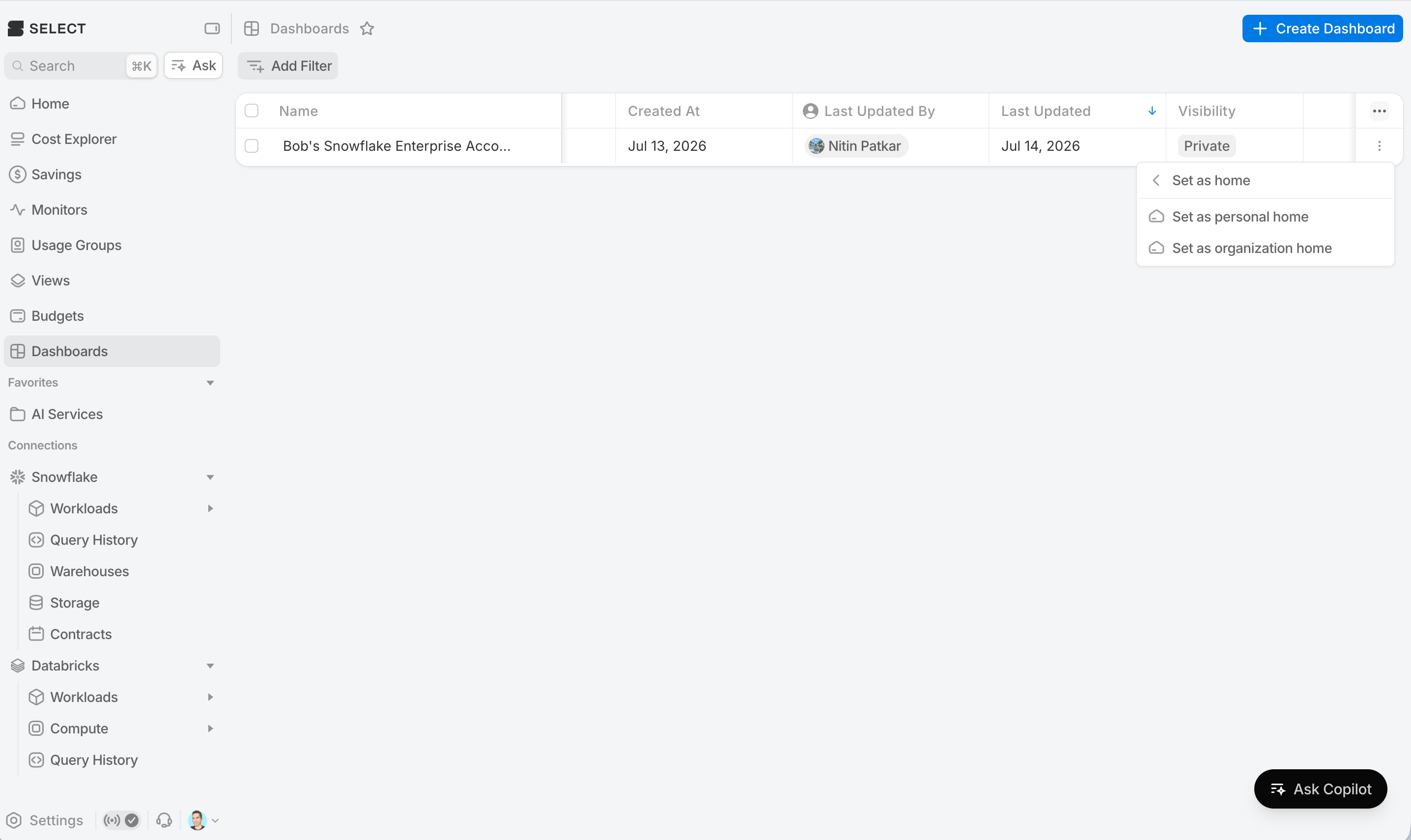
Personal home
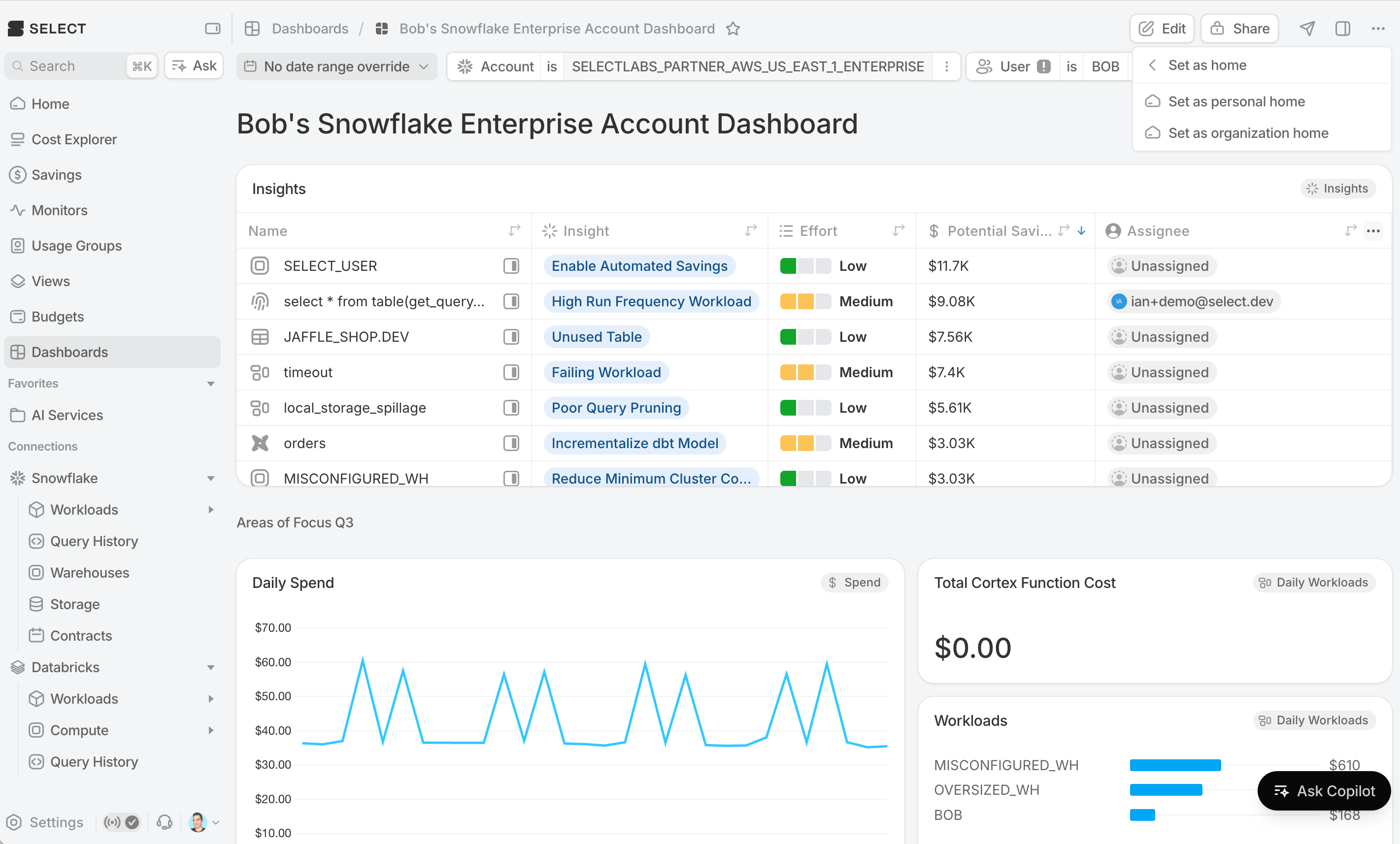
From the dashboard's options menu, choose Set as personal home. That dashboard now loads whenever you sign in or click the Select logo or click Home on the sidebar. Only you are affected.
Organization home
Org Admins can set a default landing dashboard for everyone in the organization. From the dashboard's options menu, choose Set as organization home. That dashboard now loads whenever you sign in or click the Select logo or click Home on the sidebar. Everyone in your organization will see this as their home unless they have a personal home.
If a user has set a personal home, their personal choice takes precedence over the organization home.
Scheduled send
Scheduled sends/digests deliver a snapshot of a dashboard to email, Slack, or Teams on a schedule. Use them for reporting such as weekly cost reviews, monthly stakeholder updates.
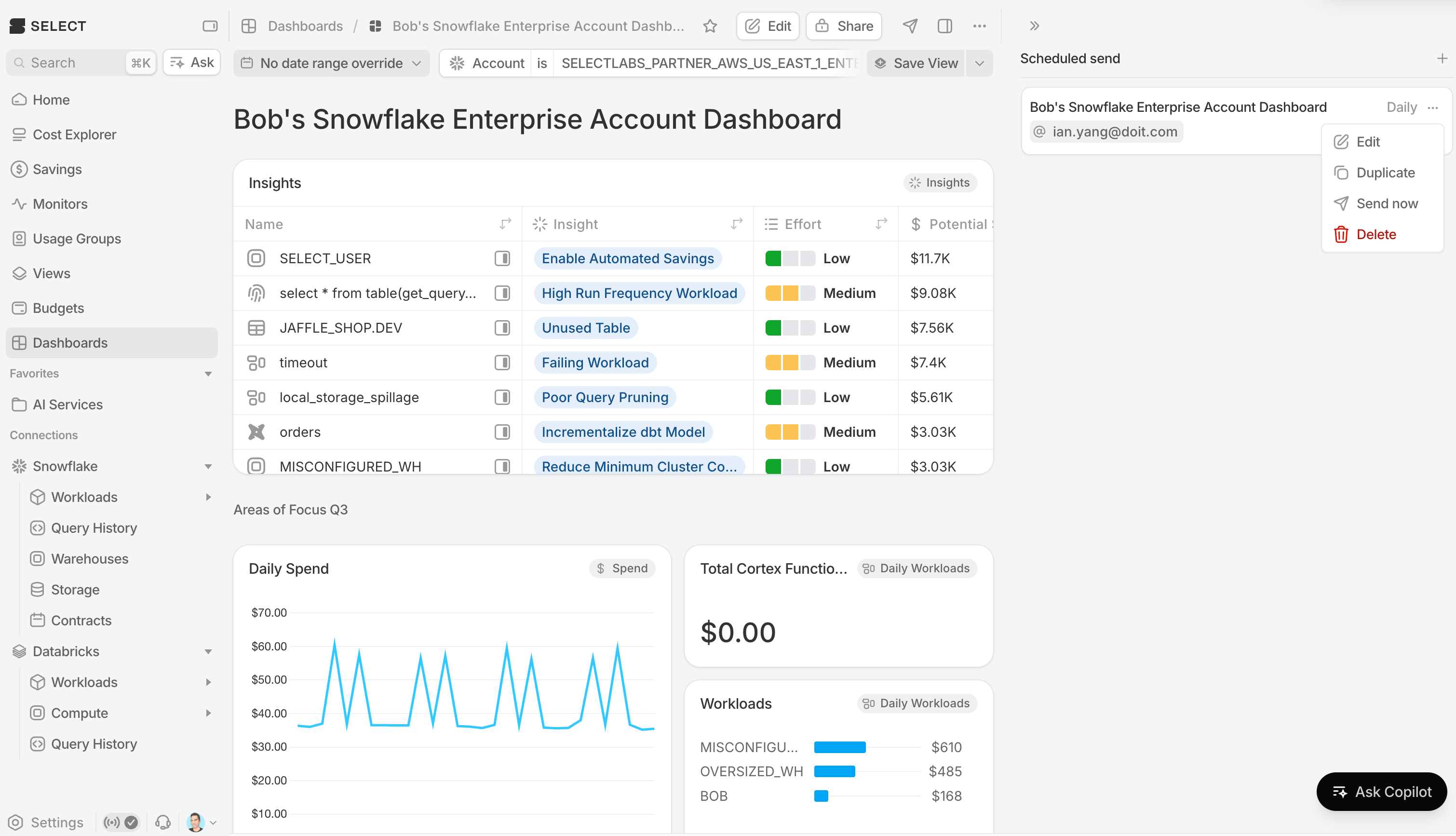
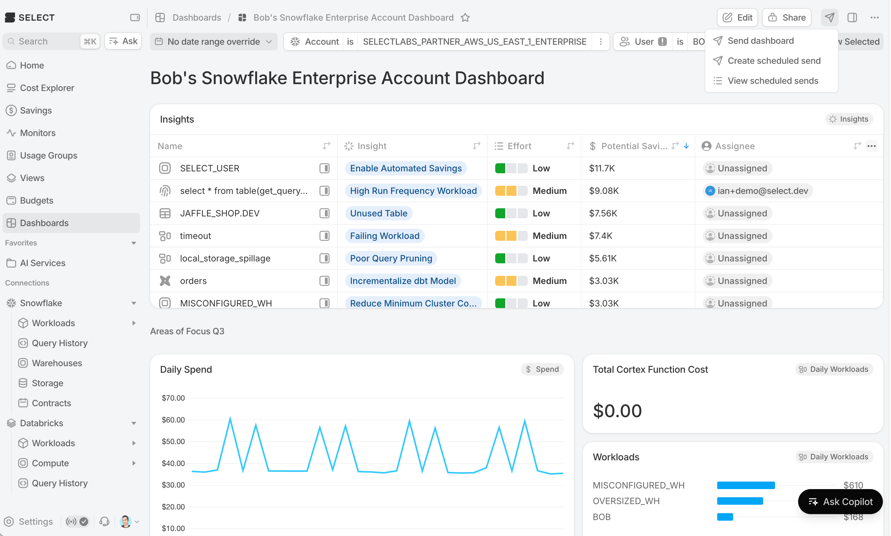
Open a dashboard and click the paper airplane icon in the top right to manage scheduled sends.
Creating a scheduled send
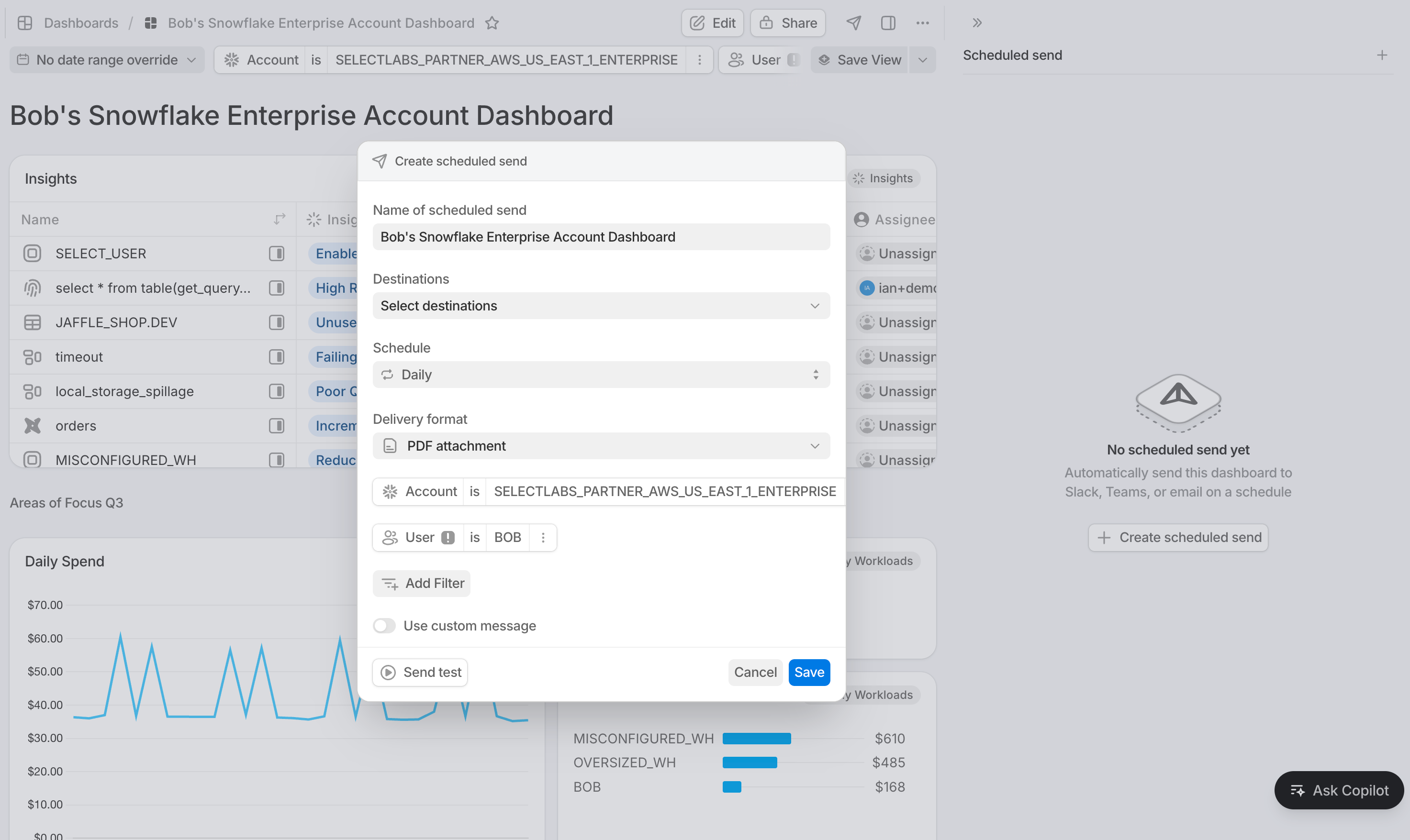
From the paper airplane icon in the top right, click New scheduled send and configure:
- Cadence — Daily, Weekly (pick day of week), or Monthly (pick day of month; months without that day fall back to the last day).
- Destinations — one or more email addresses, Slack channels, or Microsoft Teams. Destinations are managed in the same place as your monitor alert destinations.
- Format — PDF, PNG, or a URL link back to the live dashboard.
- Filters (optional) — apply dashboard filters that will be baked into every send. Useful for team-specific digests that scope the same dashboard to different slices.
- Custom message (optional) — a note prepended to the digest body.
You can duplicate an existing digest to create a variant (e.g., a weekly PDF for leadership, a daily URL link for the team).
Send now
Need to fire off a one-time send? Use Send dashboard — same picker, no schedule. The dashboard is captured with the destinations, format, and filters you choose, and delivered immediately.
Run history
Each digest shows a history of its recent sends, including status and a link to the delivered artifact. Failed runs surface the error so you can retry or fix the destination.
Exporting
Export a dashboard for use outside of Select — dropping into a slide deck, attaching to a ticket, or archiving.
From the dashboard's options menu, choose Export and pick a format:
- PDF — best for reports and email.
- PNG — a single high-resolution image.
- JPEG — smaller image file, lossy compression.
- Print — opens your browser's print dialog for direct printing or "save as PDF."
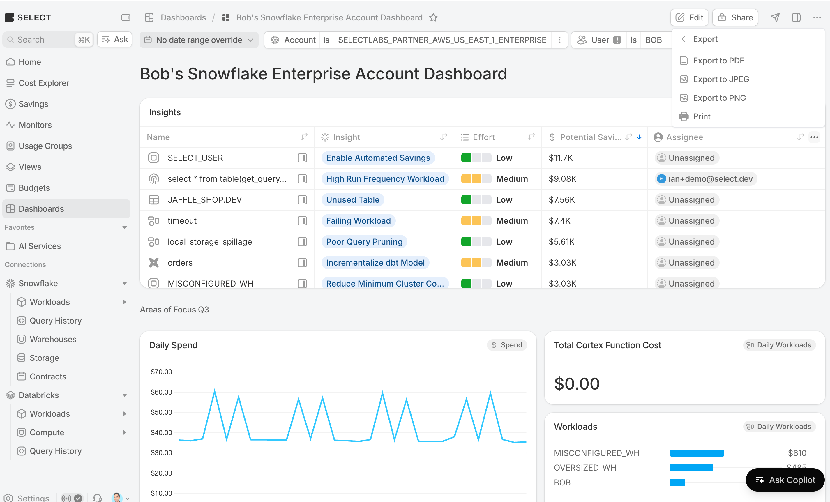
Exports capture the dashboard as you're currently viewing it, including any active filters. Apply the filters you want first, then export.
Managing dashboards
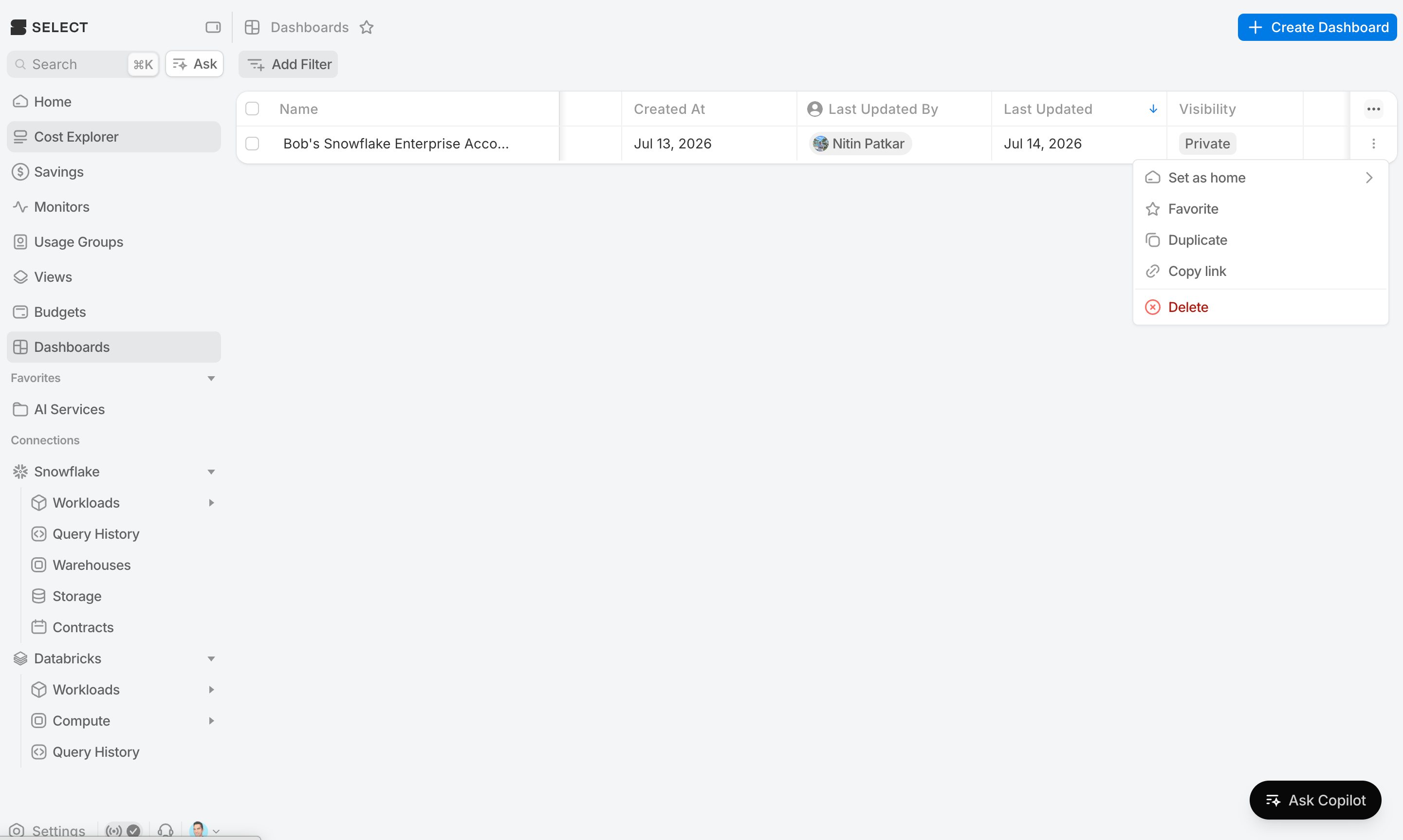
Duplicate
The Duplicate action creates a full copy of a dashboard — blocks, layout, and filters — as a new dashboard that you own.
Favorite
Click the star icon to add a dashboard to your favorites. Favorites are pinned to the top of the dashboards list and easy to jump to.
Rename, icon, and color
Click the dashboard title or its icon to edit the name, choose an icon, and pick an accent color. These help you tell dashboards apart at a glance.
Delete
The Delete action removes a dashboard. You'll be asked to confirm, and if the dashboard is set as anyone's personal home or the organization home, the confirmation calls that out.