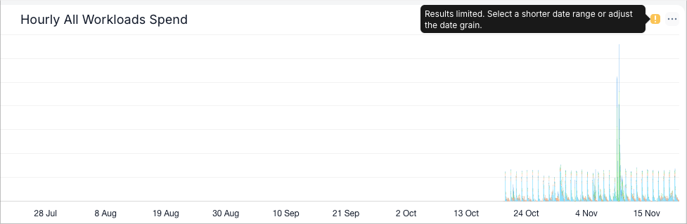
When you select a date range or time grain that generates too many data points, SELECT automatically truncates the chart to display only the most recent data. A yellow info icon will appear in the top right corner of the chart, indicating that the result set is limited and prompting you to either:
- Select a shorter date range, or
- Choose a larger time grain (e.g., daily instead of hourly)
See the screenshot below for an example.