

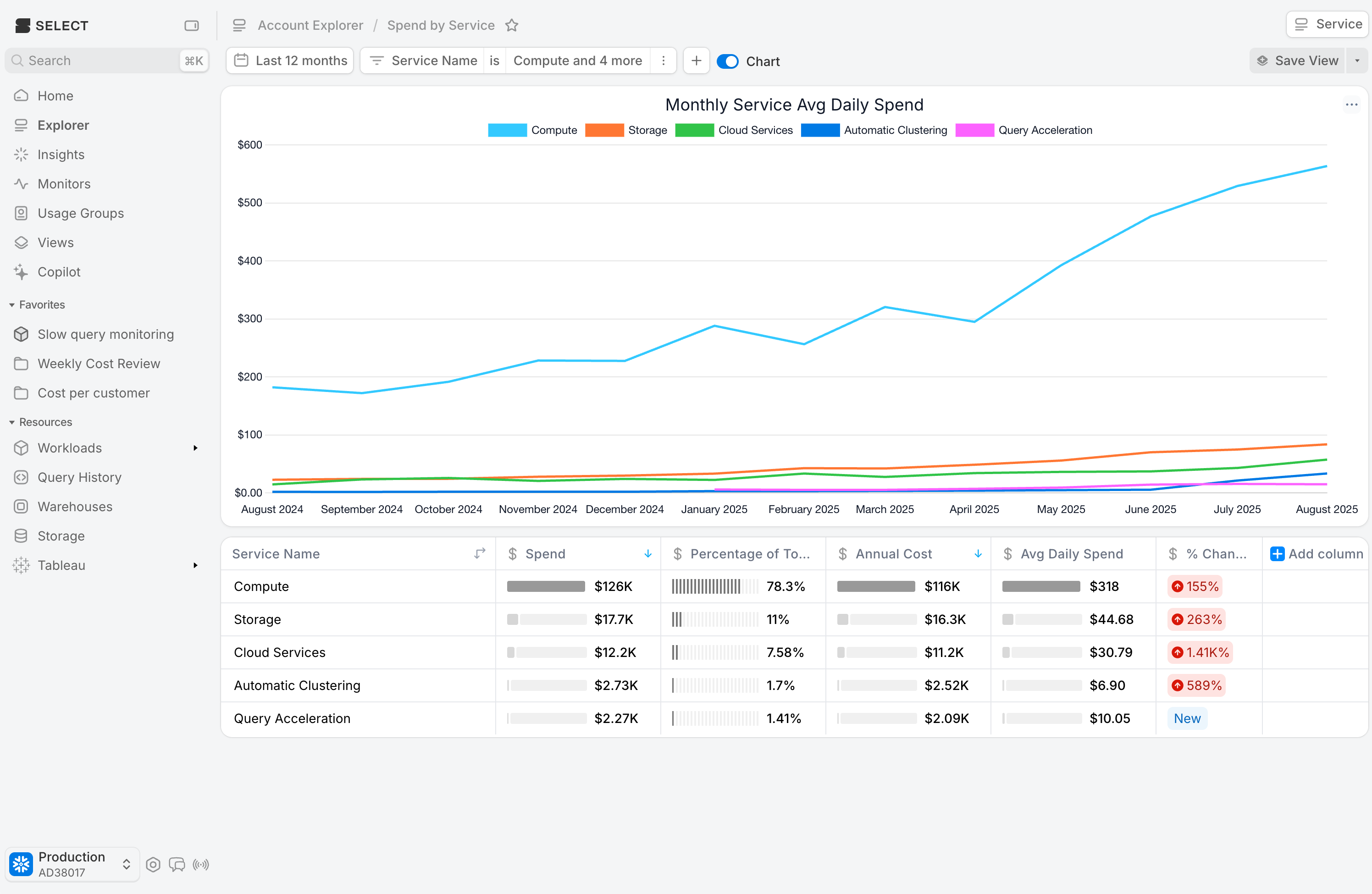
Leverage average daily spend for normalized spend monitoring
Tuesday, September 02, 2025
 Niall WoodwardCo-founder & CTO of SELECT
Month over month cost analysis can become difficult due to months having a varying number of days. To help with this, we’ve added a new metric, average daily spend, which helps you compare your spending trends while accounts for months with a varying number of days. The field is calculated by summing the total spend for that period (or week or month if using those groupings in the chart), and dividing by the number of days in that period.
This metric is currently available on the cost explorer and workload tabs.
Other Things We Shipped:
🪄 Table and chart titles now editable in monitors.
🐛 Fixed favouriting across the board for users with Tableau data.
🪄 When editing a monitor, the destinations picker is now seeded with the existing destinations for the associated monitor.
🐛 Fixed pagination on the destinations table in Notifications page
Up next.Previous Changelog Entries.