
SELECT Product Updates - October 9, 2025
Jeff SkoldbergFriday, October 10, 2025
Hello SELECT users!
It has been another busy month shipping features at SELECT! Below you'll find the highlights from the past month. Head to our changelog for a full list of changes.
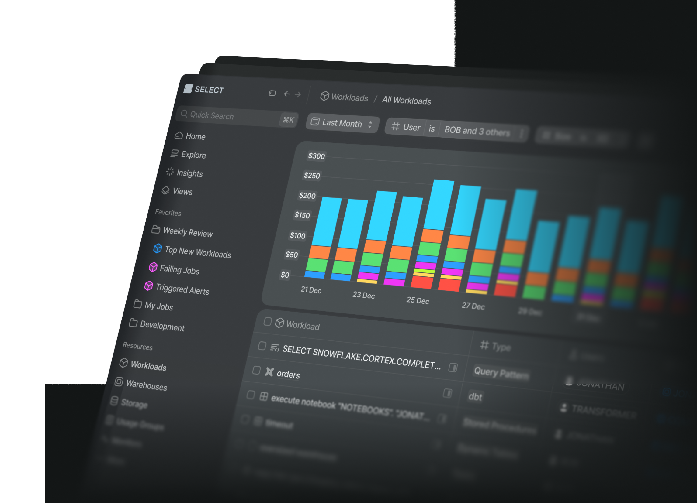
Create Monitors from anywhere in SELECT
Creating monitors in SELECT is now faster and easier! Create monitors right from where you’re already exploring data — no need to fill out the create monitor form from scratch!
Create monitor buttons on Workload, Warehouse, Insights and Storage pages
Start a monitor directly from these pages. Your filters, sort order, columns, and selected chart metric already are carried over to the monitor configure screen.
A redesigned Usage Groups Experience
We’ve redesigned the usage group management experience with improved spend coverage visualization and a new uncategorized spend manager that lets you drill down into unallocated spend across different resource types.
View the spend allocation breakdown of each of your usage groups:
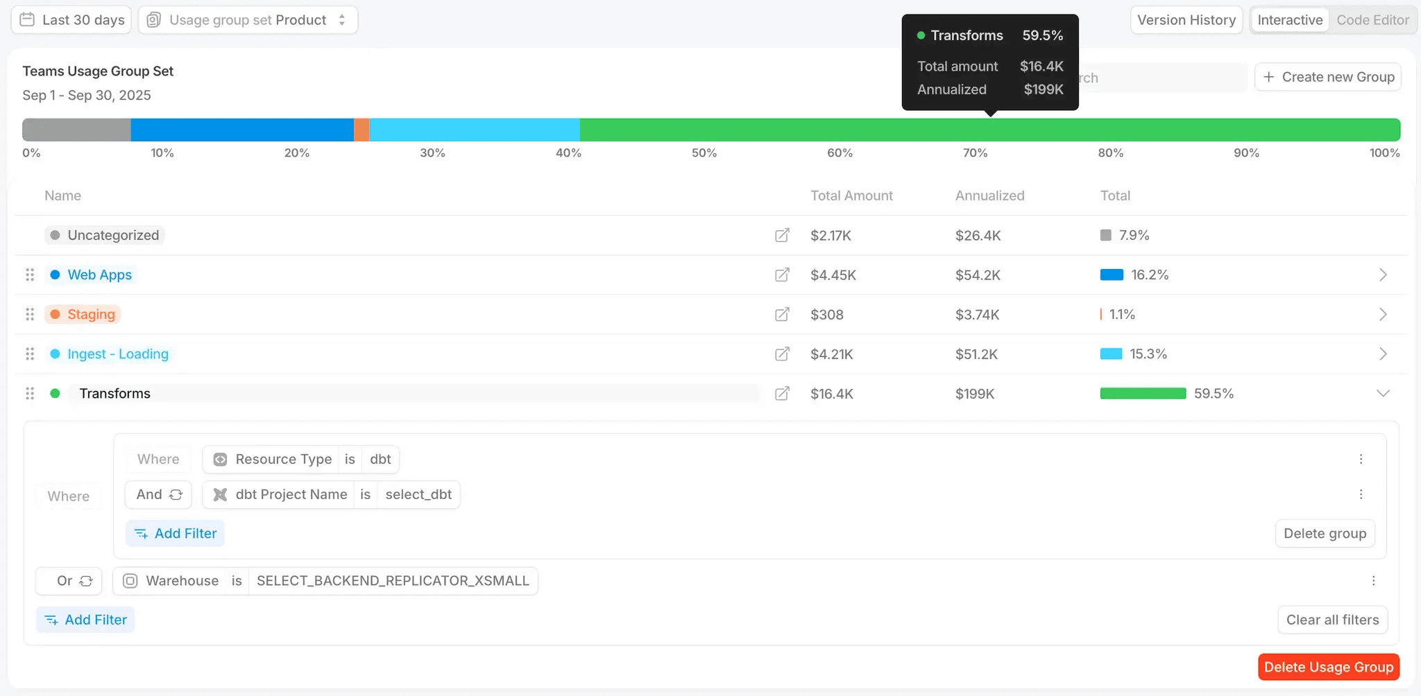
Prefer editing your usage group configurations via code? Try out the “Code Editor” mode, with JSON and YAML support!
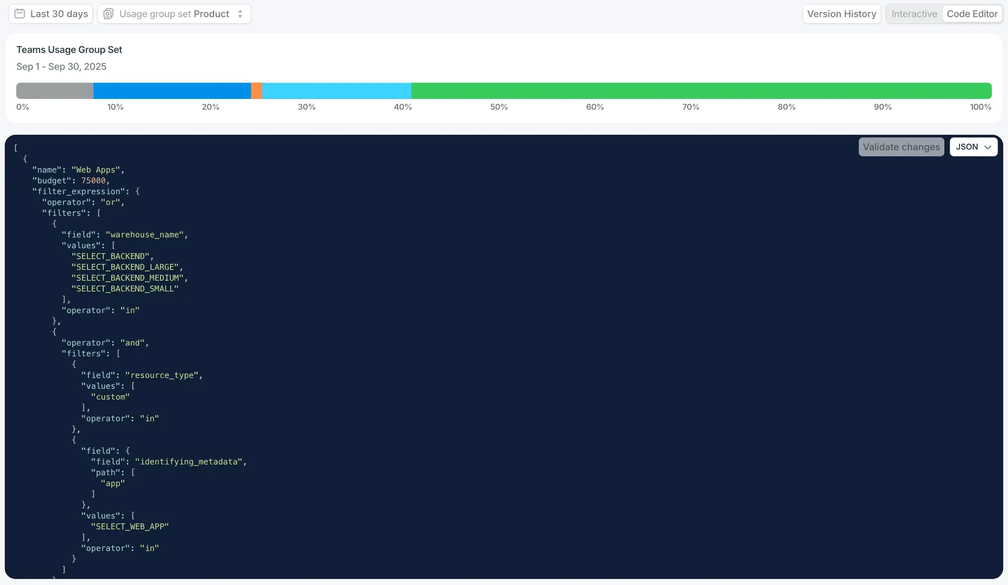
Infrastructre as code in SELECT
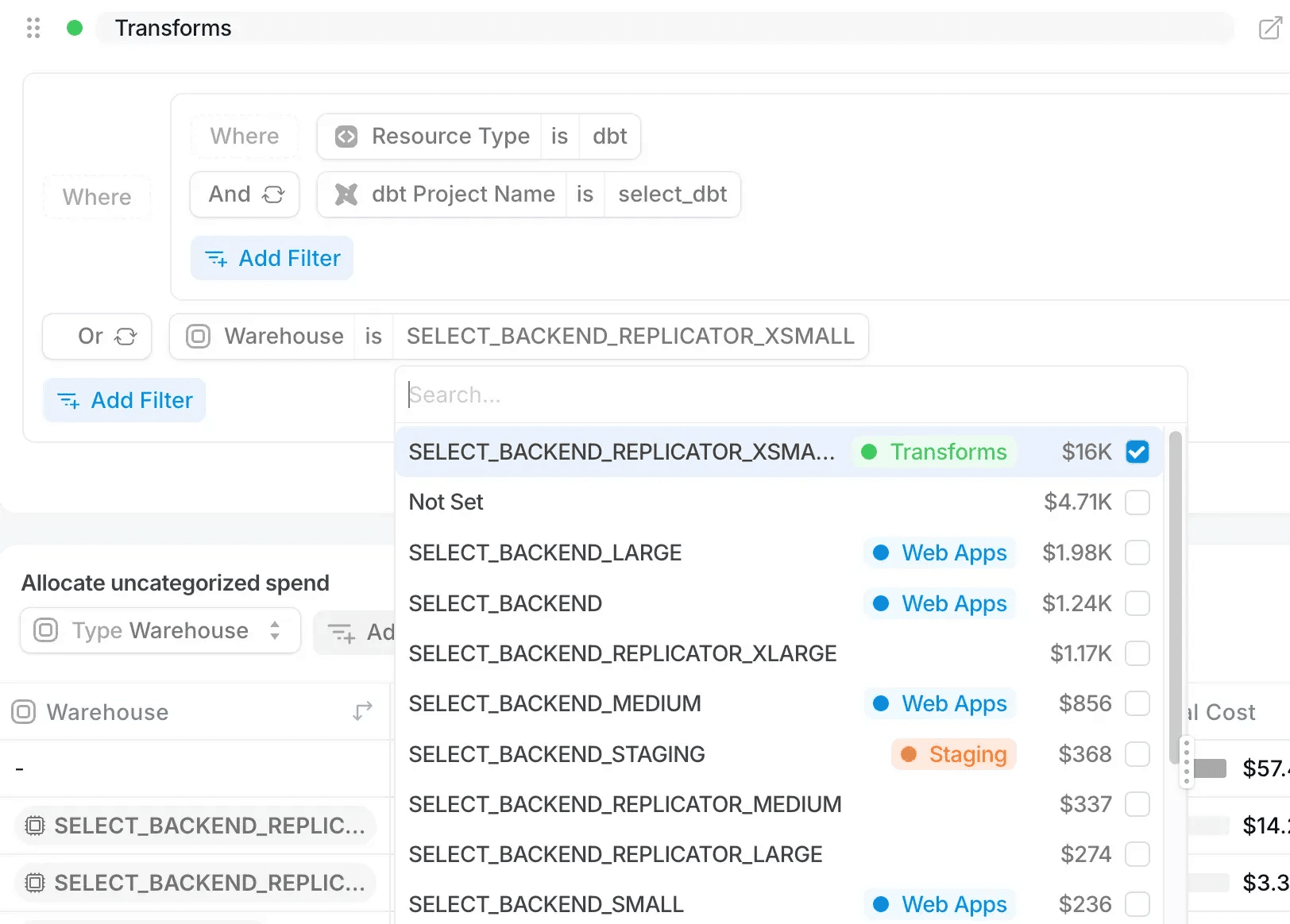
Within the filter expressions, you can now easily view existing usage group assignments, allowing you to easily understand which resources have already been categorized when creating new groups.
There’s quite a bit more to this redesign, so head to the changelog post to learn more about Usage Groups.
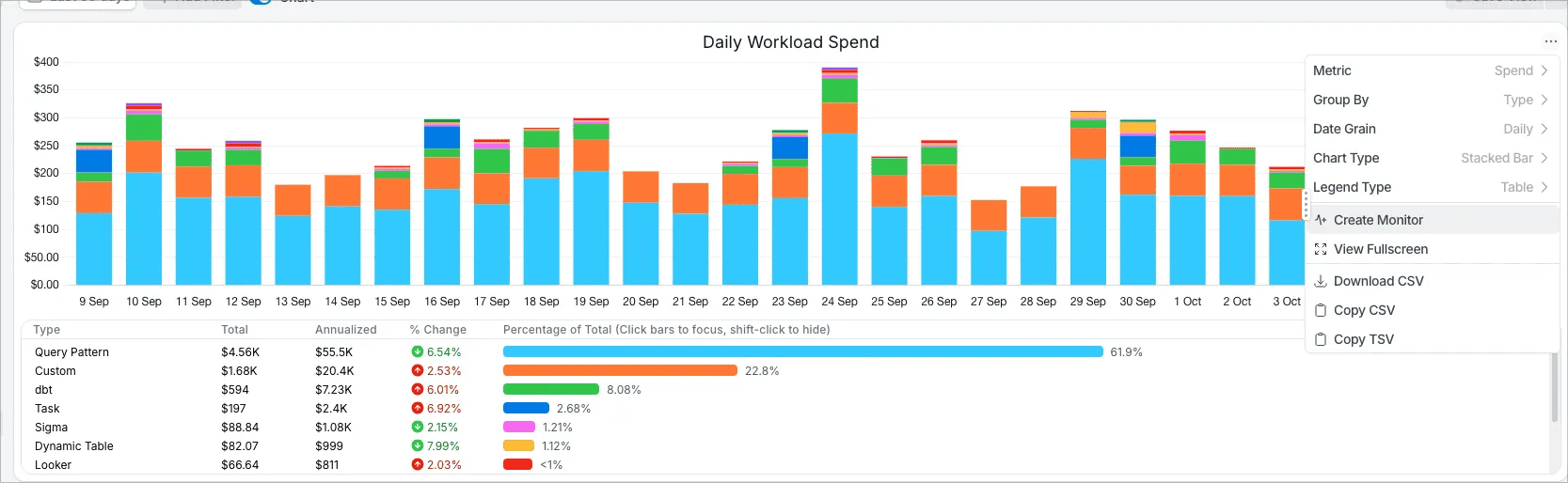
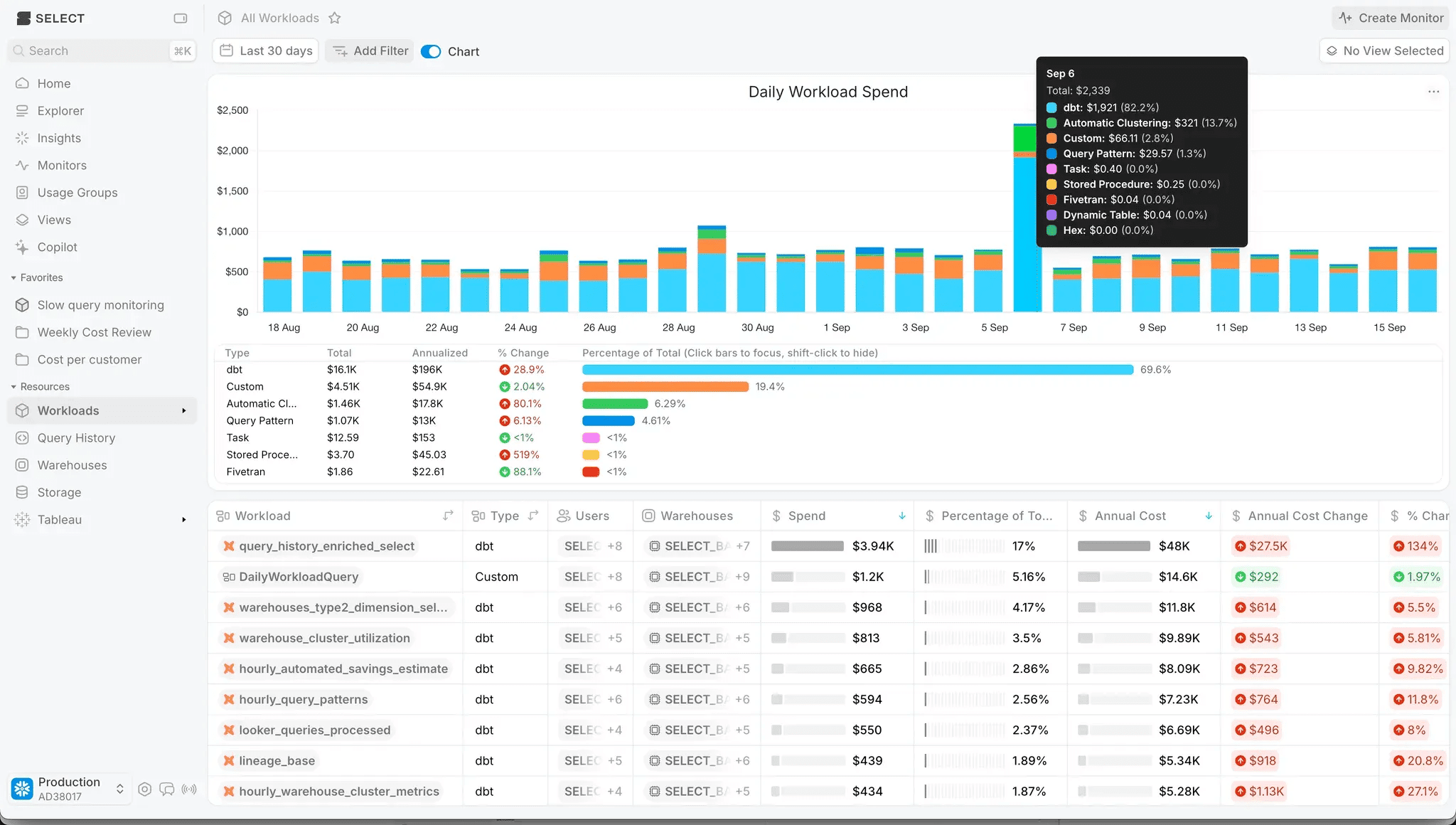
Improved Charts
We’ve updated our chart component making it more flexible and include features requested by you.
Our stacked bar chart now places the largest contributor on the bottom, making it easier to see how other metrics are contributing to the total.
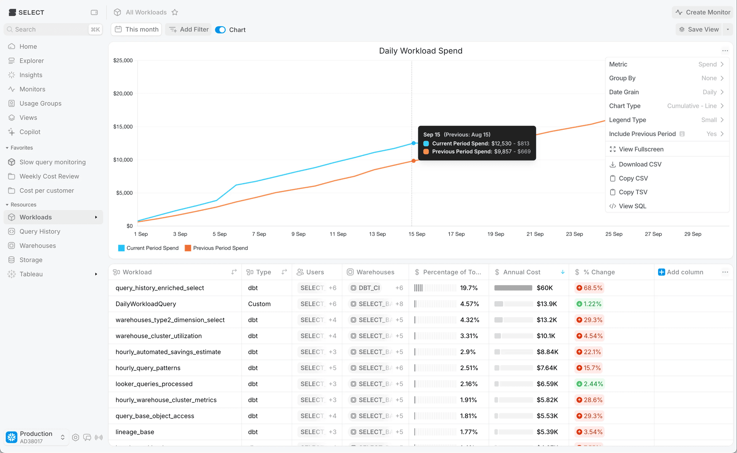
Next up we’ve got 4 improvements in one screen shot, a new cumulative chart type, an optional more compact legend, and an optional comparison with the previous period! Also, “View Fullscreen” has you covered when the data is too dense to see on the smaller chart. All of these new options can be accessed through the chart options picker at the top right.
There’s more to say about the new chart experience, so you can find all the details here.
ML Powered Forecasting
We’re now launching the ability to easily produce machine learning powered spend forecasts on all charts in SELECT! You can compare this forecast with the previous period, as seen here in orange.
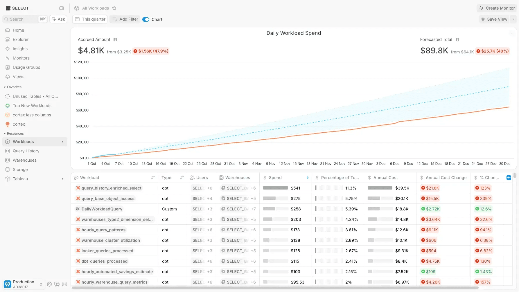
This comes with new time range shortcuts for charting ‘This quarter’ & ‘This week’ as well as a configurable training period for the forecasting model.
Teams and user management API
Managing user access across modern data platforms often involves repetitive manual tasks - adding users one by one, updating role assignments as teams evolve, and keeping SSO groups synchronized. That’s why we’ve built APIs to help you automate your access management workflows.
We’ve added APIs for User, Role, and Team Management and SSO Group Mappings. Learn more here.
Coming Soon: SELECT V2
Over the next two weeks we will begin migrating customers to V2 of SELECT, which combines all of your Snowflake accounts into a unified experience. Details on V2 can be found here. Please read the post so you are ready for the changes! No action is required from you - but we want you to be informed about the changes before they come.
Our customers keep pushing us to improve and provide incredible ideas of how the SELECT platform can be more useful. These features were based on your brilliant ideas, so keep the feedback coming!

Jeff is a Data and Analytics Consultant with 15+ years experience in automating insights and using data to control business processes. From a technology standpoint, he specializes in Snowflake + dbt + Tableau. From a business topic standpoint, he has experience in Public Utility, Clinical Trials, Publishing, CPG, and Manufacturing. Reach out any time, [email protected].
Want to hear about our latest data cloud learnings?Subscribe to get notified.
Get up and running in less than 15 minutes
Connect your Snowflake, Databricks, or BigQuery account and instantly understand your savings potential.