

New visual bars in all tables
Friday, December 08, 2023
 Ian WhitestoneCo-founder & CEO of SELECT
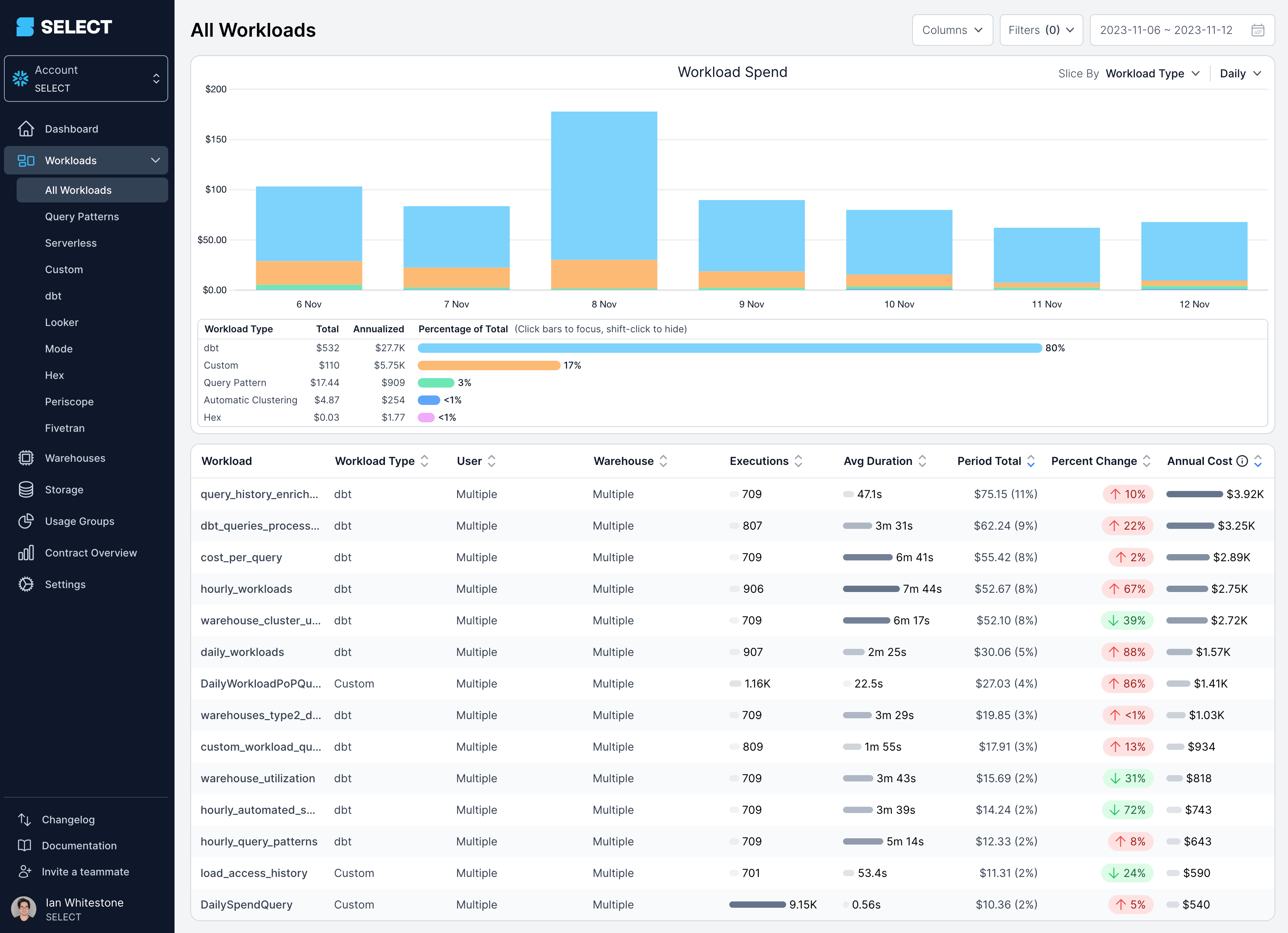
In SELECT we surface a lot of information about your Snowflake account to help you understand and optimize your usage. Combing through all this information can be time consuming, so we've added a new visual bar component to help you quickly spot outliers and trends in your Snowflake account. For each statistic, the size of the bar will be proportional to the maximum value observed.
Looking at the workloads table below for our Snowflake account, we can quickly understand how our top workloads drive a disproportionate amount of our compute spend. Similarly, we can quickly spot workloads executing much more frequently than others, or taking significantly longer.
These visual bars have been added for most numeric columns in all tables across SELECT. We believe they are the best way to analyze trends in your account, but if you would like the option to toggle these off please reach out to our team and we will add support.
Up next.Previous Changelog Entries.