

← Back
dbt Model Execution History & Run Page
Tuesday, February 21, 2023
 Niall WoodwardCo-founder & CTO of SELECT
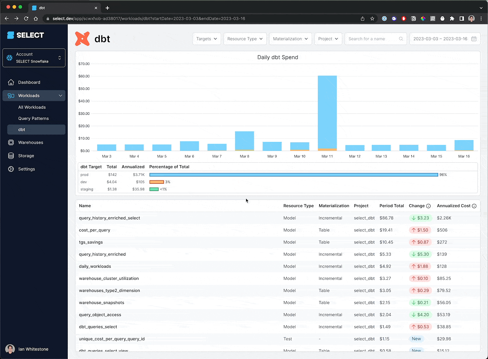
On the dbt workloads page, you’ll see a new spend overview chart at the top breaking down your dbt spend. Similar to the workloads table, a period over period change is shown allowing you to quickly spot models that spiked, or new ones that shipped. The full run history for each dbt model is also now available, which links out to a dedicated page for each dbt run.
Demo
You can see all this new functionality in action as I investigate a recent spike in our dbt spend:
- I zoom into the spike on March 11
- I see that the
query_history_enriched_selectmodel had a huge increase in costs that day - After opening up that model page, I click on the new “Run History” tab
- I see that there were a bunch of full refreshes, including many that failed
- I click one of the failed runs which takes me to the new “dbt Run” page
- Here I can see the exact SQL ran, which step of the model failed and all relevant execution details
Up next.Previous Changelog Entries.